 |
| All smiles for Mo' |
This was not only a career high for Williams, but a player franchise high for the Wolves, breaking the previous record high of 51 that Corey Brewer set late last season. It was also the most points scored by an NBA player this season. 51 points in any league is highly notable, but perhaps what makes this accomplishment even more impressive is that Williams is only averaging 12.4 points per game this season, which makes him only the 5th leading scorer on his own team!
I have been working on data visualization techniques for data scraped from NBA.com/stats (if you are a team or media and are interested in using data visualizations such as these, please e-mail me).
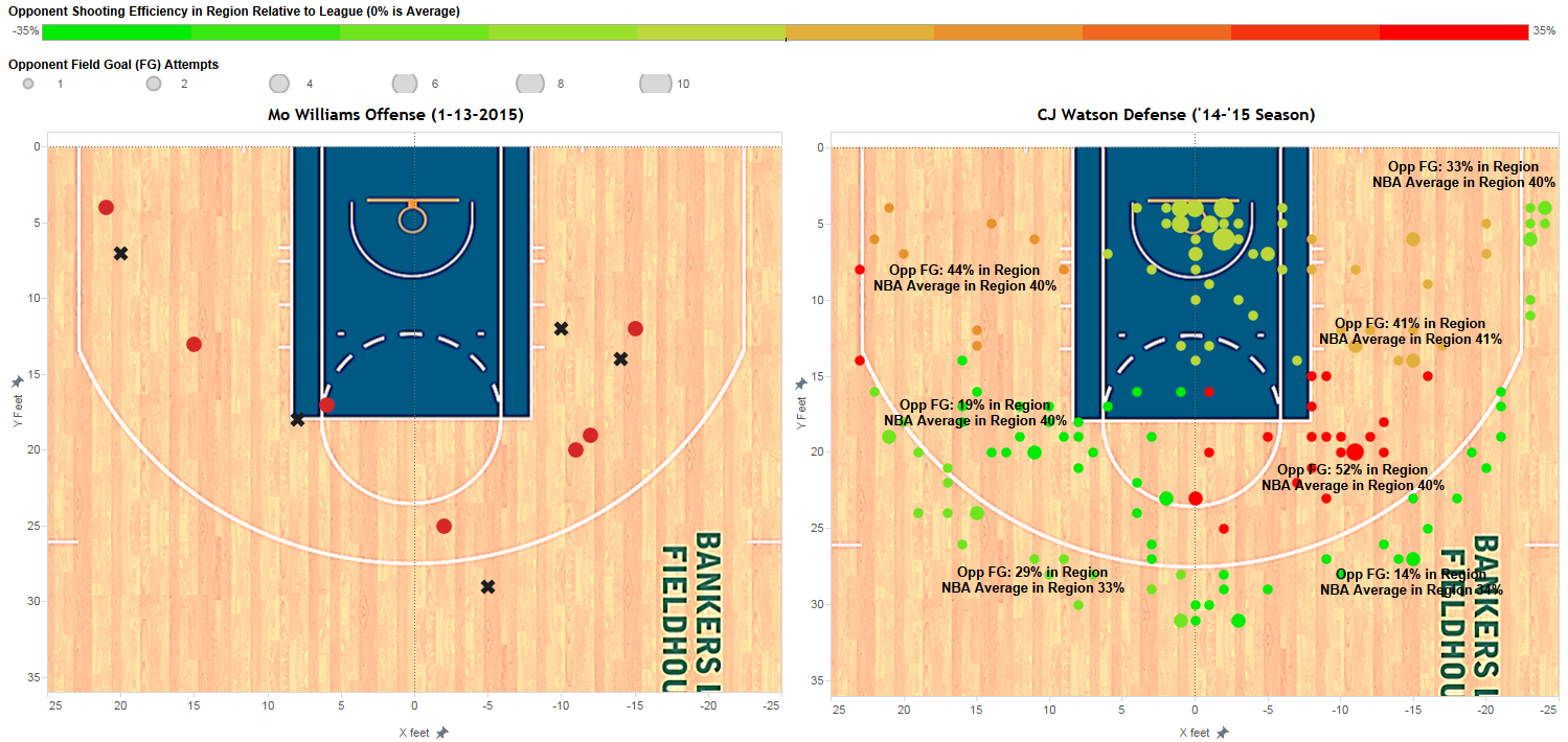
When we compare Mo's shot chart last night to both (a) the defensive heat map for the Pacers and (b) the defensive heat map for his primary defender (CJ Watson was the primary defender on 12 of Williams' 32 field goal attempts that were not half court heaves), we can see that Williams, whether or not he realized it, was using the power of data visualization strategy to exploit his opponents weaknesses.
Obviously in the heat of the game we can't expect players to be doing the maths (maybe Rajon Rondo), but in analyzing the shot charts below it is not surprising that Williams, either by luck, by design or by a bit of both, was able to have a well above average performance
Note: On heat maps, red means player/opponents shoot well in that area, green means player/opponents shoot poorly. Court is divided into nine regions.

Click on any image to enlarge it
From the diagram on the right, we can see that on average the pacers tend to struggle defensively at defending mid-range jump-shots, except on the right baseline (struggles in regions 3,4, and 8). Williams, whether he realized it or not, "counted cards" by exploiting this to turn the odds in his favor, by taking 16 shots, half of his field goal attempts, in those regions (regions 3,4 and 8) and connected on 10 of those shots (62.5%). If you look at Williams' heat map throughout the season (second image below), you can see that he actually thrives in those areas (regions 3,4 and 8, specifically), so it was a perfect mismatch!


Mo Williams vs. C.J. Watson (1/14/2015, 12 FGA):
Watson is a well above average defender in 3-pt field goal territory, but struggles at certain areas inside of the 3-pt arc, especially at defending opponents' right elbows, and also is an average defender in both the left and right baseline up to the "break" (where the 3-pt line becomes an arc) regions. Looking at Williams shot chart when Watson was the primary defender, he exploited this to the extreme - taking 9 shots from areas in which Watson is an average to below average defender (making 6) and attempting only one field goal from 3-pt range against Watson, an area where Watson is a well above average defender (Williams missed the shot).
No comments:
Post a Comment